8 Best Practices for Designing a Helpful Contact Page


The recipe for a website in 1995: Take one gray page, add a visitor counter, sprinkle with rainbow horizontal lines, insert poorly animated construction worker, add a “contact us” page and link the completed page to your web ring.
Confused? Imagine a digital funhouse where bright colors, flashing lights and Comic Sans all compete for your attention at once.
In 2016, our design is flat, we hide our visitor counters and save animation for the gifs we share in Slack chat. Yet the “contact us” page is still an essential part of every website’s architecture. There’s a reason for that: A well designed contact page directs people to the answers they need and helps them ask their questions more effectively, significantly improving their experience on your site.
But what constitutes a “well designed” contact page, and how do you know if you’re getting it right? Some of it is just trial and error, coupled with analytics from tools like Crazy Egg that allow you to visualize user behavior on your site. But there are best practices demontrated by successful SaaS companies that will help you improve your contact page. After reviewing 13 SaaS company websites, I identified 8 design principles that make an effective contact page.


1. Help customers find the page
Most of the SaaS companies I reviewed include customer support (help & knowledge base) options on their contact page and link to the contact page in the header or footer. There is a fairly even split amongst the 13 applications, half in the header and half in the footer (with a couple opting for both locations). Which should you use? The header is often more visually prominent, but usability studies show that fat footer link blocks are easily found (and used) too.
Use common language
Though contact page names varied between companies, these are the 3 most widely used terms:
“Support”
HubSpot
Basecamp
Zapier
“Help”
WordPress.com
Help Scout
“Contact Us”
Slack
Campaign Monitor
Hootsuite
Squarespace covers all the bases, using “Contact Us” and “Help & Support.” Mixpanel directly links their support page, but they use “Documentation” as a navigation link.
Freshbooks and Salesforce both show a phone number prominently in the header navigation and make it a clickable link to their contact options. It is clear they are driving phone support as the primary choice (a design decision I’ll cover later in this list).
Any of these terms will be recognizable to your customers, as long as you make them easy to locate and you pick a phrase that is not too similar to other links in your navigation. For example, using both “contact” and “help” for different pages adds another decision point that can frustrate someone who needs to talk to support.
Takeaway: Don't make people hunt for your contact page — stick with a standard location.
2. Humanize your customer service team
Customers who are looking for help are often stressed and frustrated, and when they can only communicate with you through text chats or emails. It’s easy for them to feel unimportant or ignored. In my career, I’ve heard versions of “I want to talk to a real person, not a robot!” from customers many times.
Research shows that our brains are finely tuned to recognize faces, and having other people around tends to create more cooperative behaviours (even just a poster of a face has that effect).

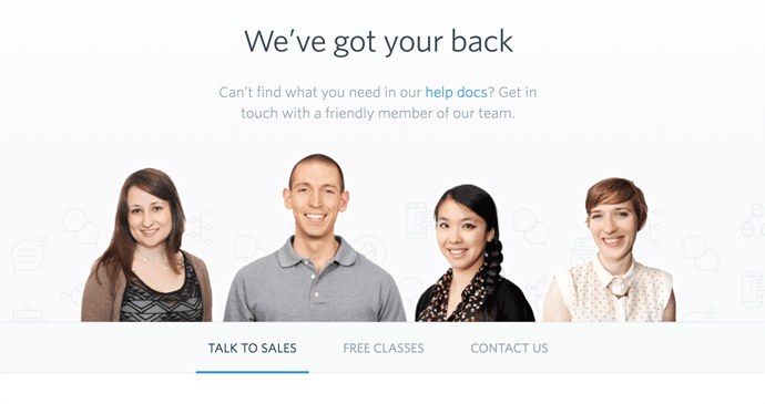

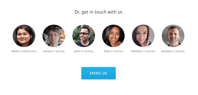
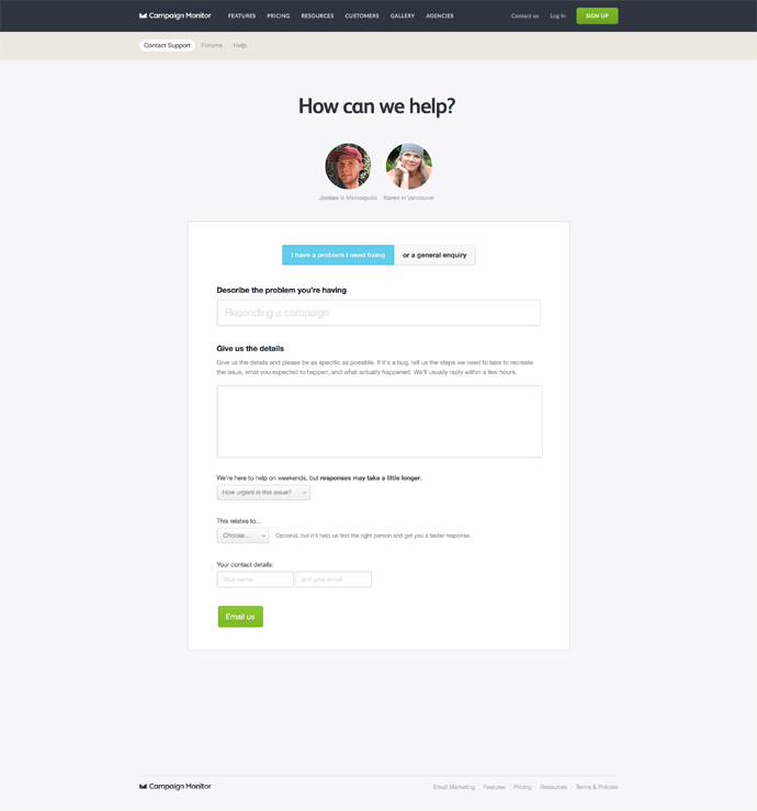
Help Scout, Campaign Monitor, and Zapier all feature photos of their real support agents on their contact pages. Basecamp uses fun illustrated portraits. Showing that there are real humans on the other side of the page is a simple way to make your customers feel more confident that they will be helped, which in turn may make them more likely to be relaxed and polite in their interactions.
Takeaway: Use faces on your contact page to improve customer interactions.
3. Adapt the page to the situation
There is no single perfect design for a contact page, because every customer needs help with something different, and the information you want to give them can change over time. To solve this, several companies use “adaptive” contact pages that address more unique customer requests.
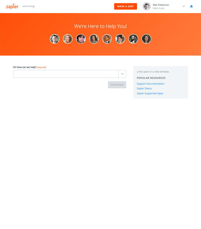
Zapier’s contact page asks the visitor to start by categorizing their issue, then uses that selection to show one of several different forms asking for more detail.
Campaign Monitor’s contact page follows a more time-based model:
During a live service interruption, a prominent alert appears on the page, pointing people to their status page for more information and updates.
Depending on the time you visit the page, you’ll see names and photos of the customer support team members working those hours.
On weekends (when support coverage is lower), customers can select the urgency of their issue, which helps smaller teams prioritize their queue.
Logged-in customers will see a phone number if their plan includes phone support.

Takeaway: Adaptive contact pages save time & frustration for your customers.
4. Centralize your contact options
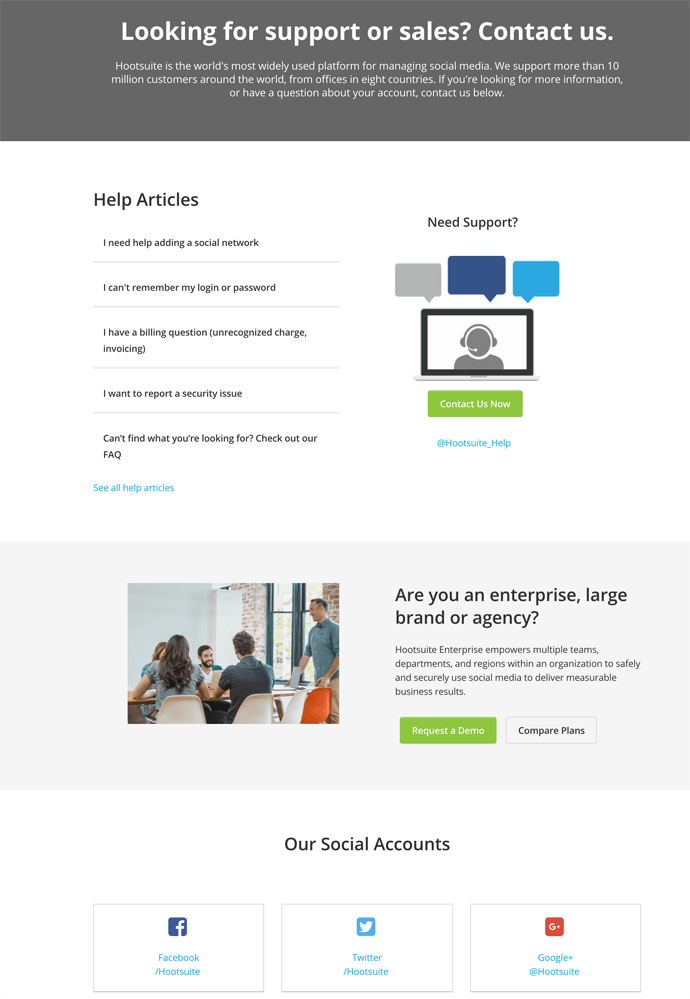
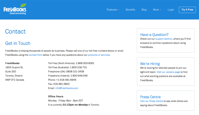
Freshbooks is a great example of aggregating all the contact options in one location. Whether customers need technical help, updates on a current issue, or to make a press contact, it’s all available on one page.
While some companies distinguish between self service knowledge bases and active support, at minimum, cross linking all your contact options helps people more easily find their way to a solution.
Most of the pages I reviewed linked to FAQs and documentation from their contact pages. Hootsuite, HubSpot and Basecamp all added social support channels as an option. Consider adding links to your customer community forum, pre-recorded videos, or training options too.

Takeaway: Use your contact page as a hub for all your support platforms, not just email.
5. Use design to guide people to specific channels
The best support option for each customer depends on who they are, what their question is, and what resources the company has available to help them. For example, a customer who needs to reset their password is better served by a simple help document than by potentially waiting hours for an email reply with the same information in it.
Your support team offers much more value to your customers by helping them understand how to use a new feature than they are in telling them where the password reset is. Thoughtful design will direct customers to the appropriate channel to get the most effective help, thus saving your support team’s time for bigger issues.
Basecamp’s contact page design gives customers three steps to follow:

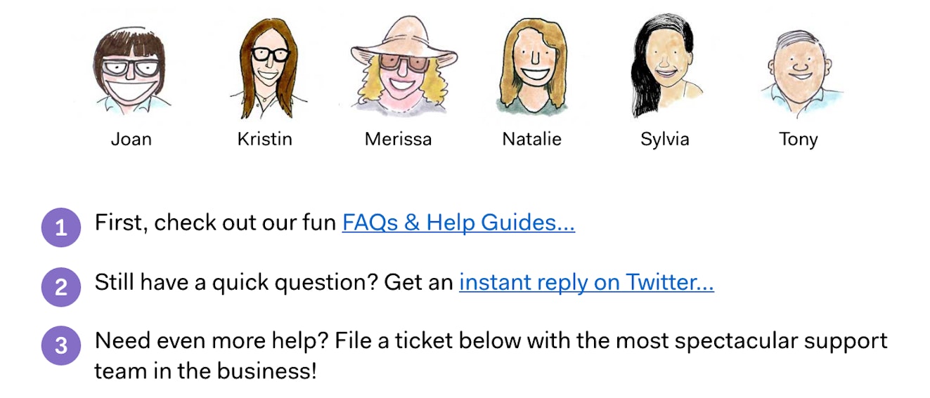
Though Basecamp doesn’t enforce that order, it’s clear guidance on how to get help most effectively.
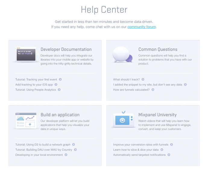
Mixpanel goes further — their main help page drives people to their community forum for help, then prominently features documentation and learning resources. To send them a direct email, you need to find their address in the footer.

At Freshbooks, it’s clear that phone support is a priority. The copy begins, “Please call one of our toll free numbers below or email FreshBooks using the contact form below.”

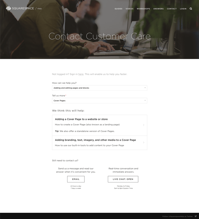
Squarespace asks their customers to categorize their question first, and then they present likely answers from the knowledge base before offering email and chat contact options.

Takeaway: The design of your contact page influences how and where people go for support — be intentional!
6. Add structure to incoming questions
Great contact pages walk a fine line between making the customer do work up front and saving them time overall.
“Average replies before a conversation is resolved” is a valuable customer service metric for your support team. But when the initial question from a customer isn’t clear or doesn’t contain enough information to answer the question, that average takes a hit. (I would hate to know the number of support replies I have personally sent that boiled down to “Can you please tell me which account you’re talking about?”)
Adding additional fields and guidance to contact forms can help you do the following:
Automatically direct different requests to the appropriate teams. For example, you can send prospects to your sales team, job applicants to your people team, and product support to your customer service team.
Show appropriate FAQs and support options. As shown above, Squarespace narrows down their knowledge base results according to the options you choose to describe your question.
Provide the support agent with account tools and history. If a customer can tell you the account they log in to or their company name, you can often give your support team access to internal tools and data to help them answer much more quickly.
Inform your reporting. Letting customers self categorize their questions by product area, issue type, or the like gives your team great insight into where your main support issues are coming from and perhaps where the product teams should be focusing.
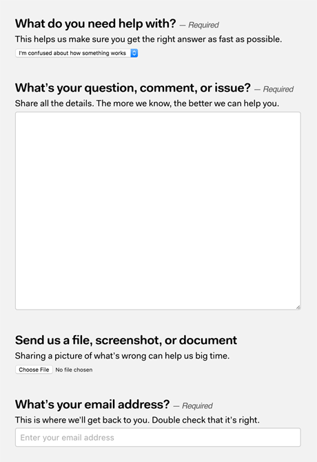
For some types of support, prompting customers to attach a file or a screenshot along with the question can shorten a conversation considerably. Basecamp’s contact form includes a file attachment option right up front.

Takeaway: The right amount of structure on your contact page can save time & hassle for you & your customers.
7. Set expectations for response times
As Tom Petty once said, “The waiting is the hardest part.” Unless you offer real-time support, giving customers an idea of how long they should expect to wait lets them decide how to proceed and builds their confidence that they’ll get a response.
Freshbooks notes their office hours and helpfully lists the current time at their office.
Basecamp says, “Expect a reply between 8am CST - 6:30pm CST Monday through Friday.”
Campaign Monitor quotes an email response time of “a few hours” (but changes the page over the weekend when response times increase).

If they are told email responses can take a day, a customer may decide to try self service options and ultimately solve the issue on their own. Alternatively, if the wait time is acceptable, they can move on with other tasks knowing the answer is on the way.
Takeaway: Don't make customers guess how long they'll wait for a reply - give them a timeframe on your contact page.
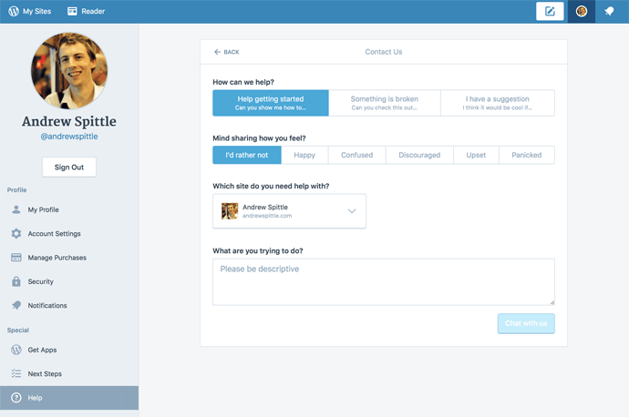
8. Allow customers to tell you how they feel
One of the top customer service skills is the ability to read customers and really listen to them. When providing email support, that can be very challenging. Kevin Hale, co-founder of survey company Wufoo, wanted to better connect with his customers and decided to ask them directly for their emotional state.
Letting customers share their emotional state is a great indicator to the support team of how to approach their response, but it can also let upset customers vent in advance of talking to your team.
At WordPress.com, they’re trialing a similar option for their logged-in customers.

Of course, once you ask a question, your customers have reason to believe you’ll do something useful with that information, so be prepared to deliver!
Takeaway: Asking customers to tell you how they feel helps you provide better service.
Questions to help you build your own contact page
The right contact page for WordPress.com or Basecamp isn’t necessarily the right page for you and your customers. I’ve given you some examples to learn from, but nobody knows your customers’ needs better than your own support team.
When thinking about your contact page, ask yourself the following questions:
How can we direct customers to the appropriate channels?
Can we provide the same quality of support across all of our channels?
What can we do to set customer expectations and build their confidence before they’ve even talked to us?
When you direct your customers to your knowledge base, you want them to have an excellent self-service experience. Read our knowledge base playlist for tons of advice and examples to help you make it happen.


Get Started
Learn the platform in less than an hour.
Become a power user in less than a day.