Announcing the Help Scout Brand Handbook


A good manual teaches that an identity is more than a logo.
This is a big one, friends: Following our visual rebrand a few months ago, Help Scout is thrilled to release our new Brand Handbook.
In it lie the values that guide us, as well as a compendium of design and content elements along with detailed instructions on how to use them.
Many organizations release materials like these out into the wild, but why? Is it another way to get Twitter talking about your company? Or do the weirdos on the brand team want to show off how much they know and care about design?
We’re sharing our handbook because it’s a living and breathing toolkit, built by the creators of our brand’s values and identity. And these toolkits offer guidance to existing and future voices of those who will make, do, or say things on behalf of or in partnership with Help Scout. It’s our language, and our instructions on how to speak it.
A brief history of identity systems
The purpose of a manual is to teach people a language.
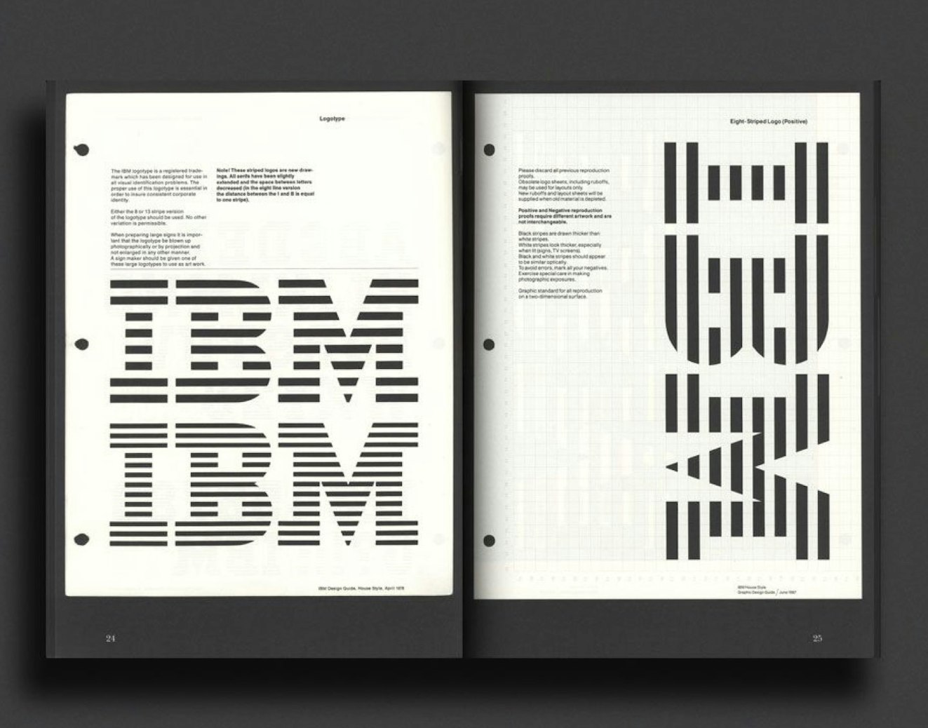
Design manuals have been around less than a century. During the late 1950s through the early 1970s, designers like Saul Bass, Armin Hofmann, Massimo Vignelli and Paul Rand set out to make sense of design during the strict Swiss Design Movement — it was a time of white space, tight grids, and sans serif fonts free of ornament or superfluous decoration, and its legacy lives on as standard best practices of design today.
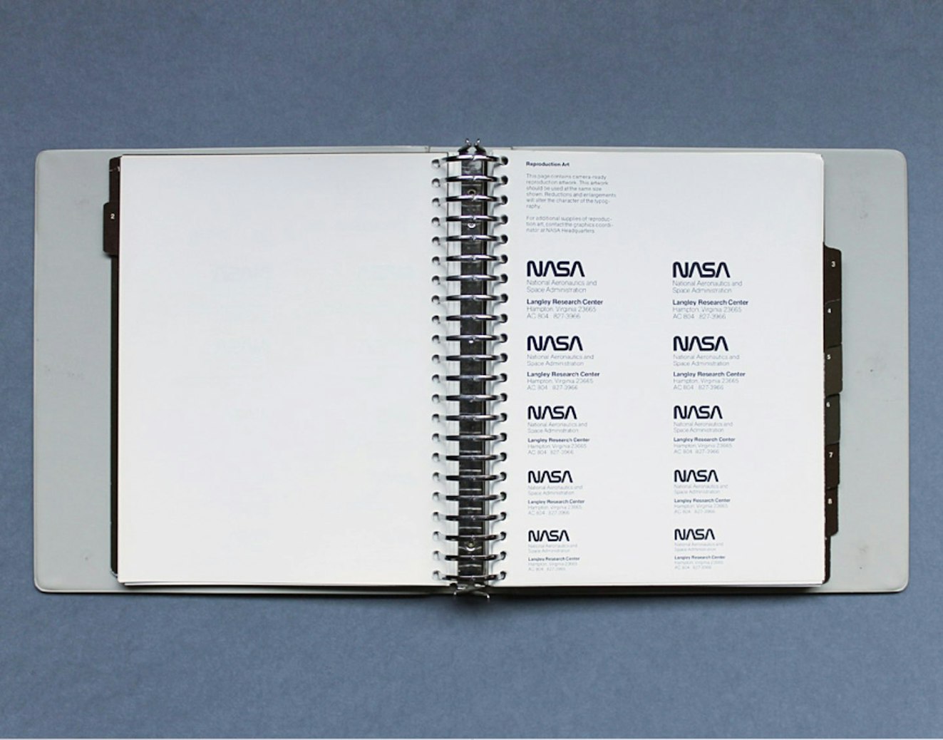
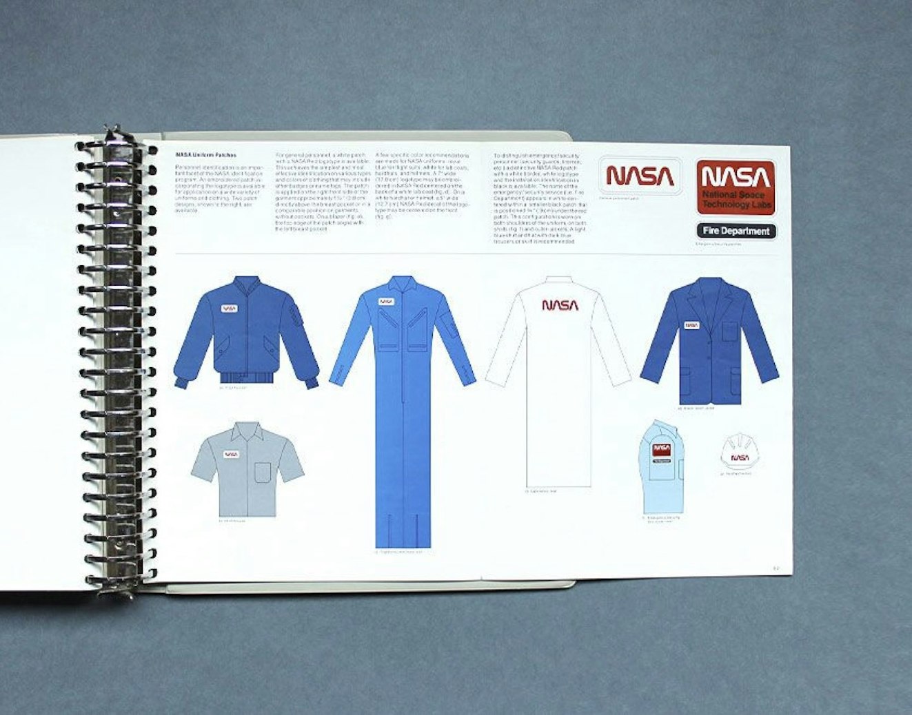
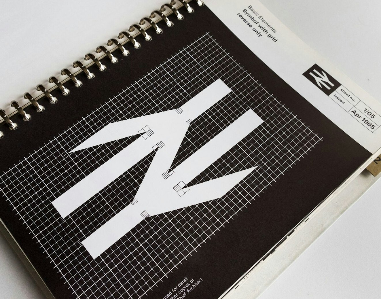
In the ‘60s, entities like Lufthansa, New York City Transit Authority, and NASA worked with design studios to build a graphic identity. To teach the language of that identity to the company’s team, they would make a detailed but easy-to-understand manual for that company, to communicate how to extend their new brand out into the world.

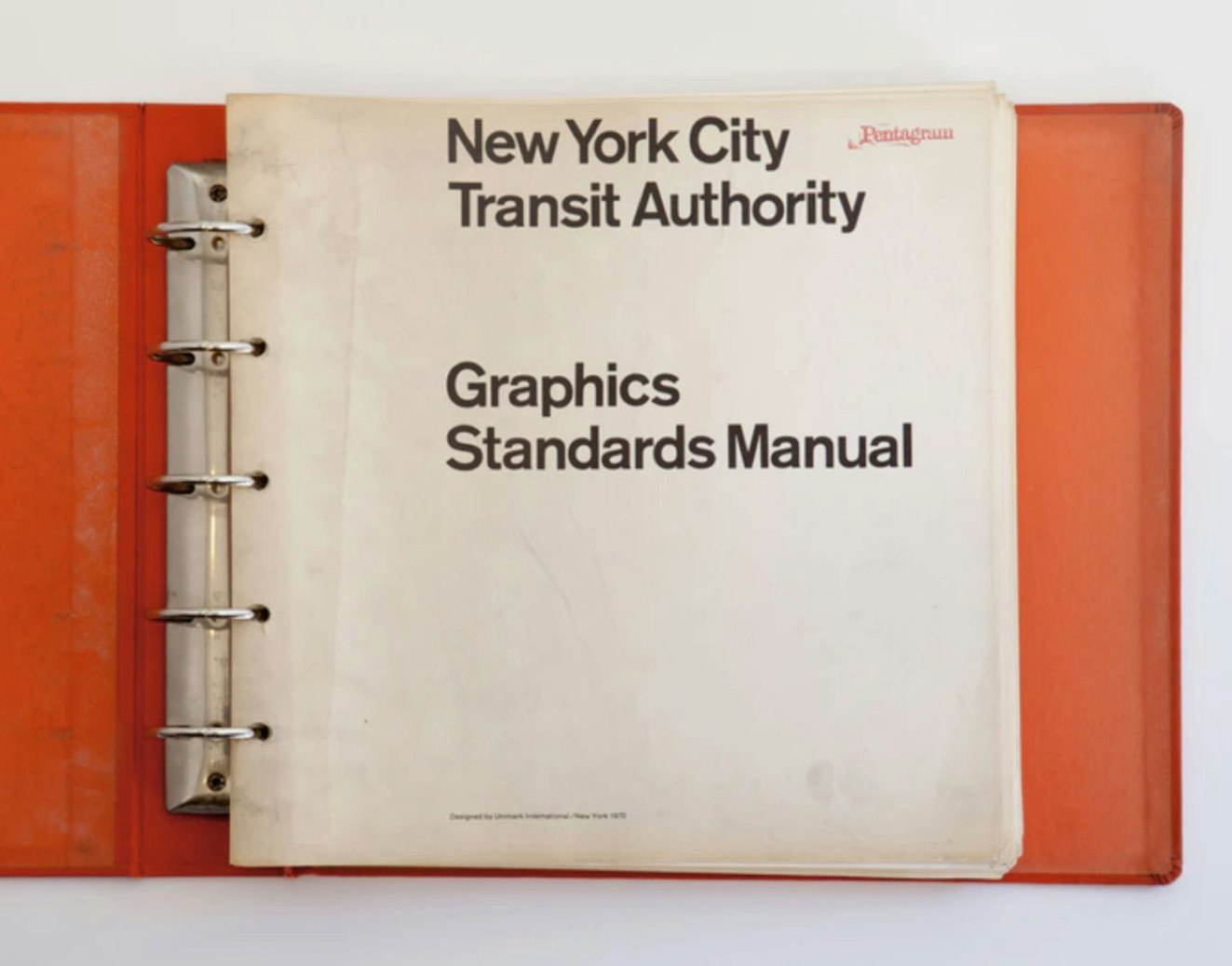
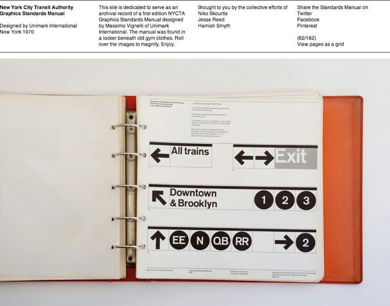
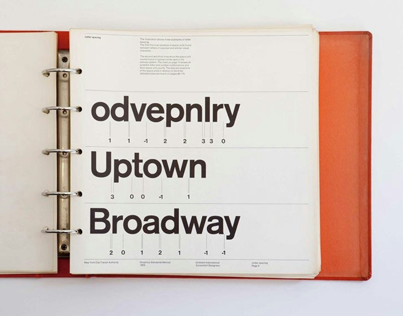
I’d like to get nerdy for a minute and talk about one interesting artifact these manuals had in common: They were often bound in ring binders. These books weren’t designed for coffee tables or display cases. They themselves were designed as a tool, in this pre-digital age. In the '60s, if a logo or a typeface needed to be duplicated, a page would be physically removed from the manual and walked to a studio so it could be copied with a process camera. There was no Sketch, or Figma, or Photoshop. These pages would move, exchange hands, and be used.
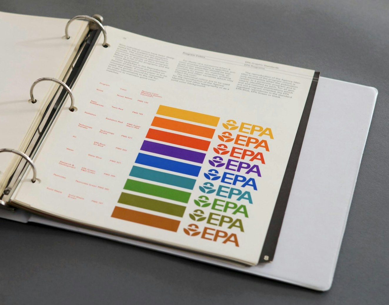
Another reason these manuals were ring-bound was that they were the one true source for a company’s color system. Designers would take a page of colors out of the book and off to the printer for accurate color-matching. And since those colors would fade over time, the swatches would need to be replaced as the rest of the book aged. Fascinating!
The permanence of a printed manual was meant to create consistency and control, but they were by no means set-in-stone brand commandments. Designers would occasionally paste real objects into these books, scrapping together bits of new information as the brand grew. It was important for the holders of the brand to decide on those hard and fast rules, and to agree when it’s time to break free from a system, or to re-design something entirely. The constraints were meant to be taken seriously, but if a designer felt a real need to deviate, amendments could be made with their guidance, and the new rule would be set in place.
Now we have computers. And the internet. And while it can be scary to allow just anyone to download all of your company’s design assets in one zipped-up file, offering up assets in a neat little package gives the brand owner full control over the assets that are available to the public. It’s better to offer things up front this way, rather than leave people to fend for themselves and potentially find low-res files or outdated logomarks. This way, there’s a single source of truth for partners, team members, journalists and everyone else to ensure they’re using the most accurate and up-to-date elements.
Despite how cool those old ring binders were, we decided a website was probably the best place to house our values and Brand Handbook. Like the ring binder, it acts as a permanent source of truth, with the flexibility to change a few things down the line, as our system evolves and grows.


But one might still wonder, in the digital age with auto-updating Design Systems and so forth, why should we even need a handbook like this one?
Well, for the past year, Help Scout has been doing some soul searching, introspection and self-evaluation. We’re a 90-person company now, and we’ve been around for eight years. We’ve been dedicated to building a great product that helps our customers talk to theirs, but why? And what guides us in these decisions?
It’s important for a company to check in with itself every once in a while, as it constantly grows and changes and hires new people to make things. Those people will change; their tools will change, and the market will change. But what will remain true? What has been with us from the beginning, and what will be with us for a while?
We looked at the values that came out of our rebrand only six months ago, and set out to define them in a bold way.
Trustworthy
Helpful
Energetic
Human and Organic
Curious

That resulted in our Brand Handbook, complete with clearly articulated values defined by characters and shapes and colors. (Other design team members will be sharing stories behind those characters and shapes soon.)
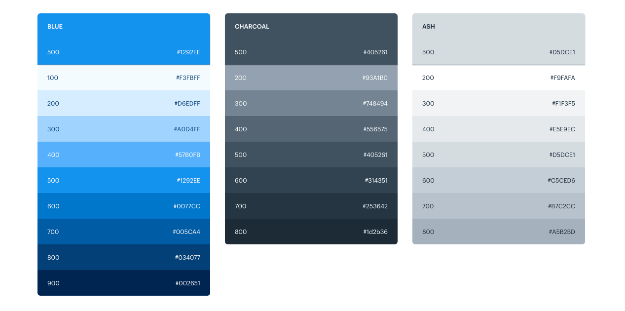
There are some fun Easter eggs in the handbook, too! The color palette page, for example, copies a color’s hex code to your clipboard simply by clicking on it. This makes it quick and easy for anyone to copy our colors into their keynote presentations or sketch files (if they aren’t already set up with our Help Scout Design System.
We’ve outlined the rules on how to use those design elements, like our logo, type, and color, with a few modern additions like our illustration style, and a complete guide to writing in our Content Style. Our Brand Handbook goes above and beyond in teaching the “language” of the brand to the people we work here, with detailed information not only on what our language is, but how to speak it in various contexts.

In cases where things evolve quickly — places like our Product and our Mobile Design standards — technology is changing so fast that it’s harder to create a set-in-stone rulebook. It would be changing every month! Instead, we’ve outlined the principles that guide us, as those are less likely to change in a serious way.
We’ll be sharing more about our design system, how we feel it evolving, and what we’ve discovered during this process. Stay tuned!
Linda Eliasen
Linda is a Help Scout alum who loves the challenge of distilling complicated techy stuff down to something people can cherish and understand. She lives in Brooklyn with her plants, where she spends a lot of time doing jigsaw puzzles. Follow her on Twitter.