Color Psychology in Marketing and Branding is All About Context


The psychology of color as it relates to persuasion is one of the most interesting — and most controversial — aspects of marketing.
At Help Scout we believe the problem has always been depth of analysis. Color theory is a topic of complexity and nuance, but color psychology in marketing and branding is typically represented in splashy infographics that rarely go beyond See ‘n Say levels of coverage.

These surface-level discussions leave us unequipped to make smart decisions about how to use the color spectrum to convey the right message with our marketing and branding. But why is such a potentially colorful conversation so unwaveringly shallow?
What is color psychology?
Color psychology is the study of how colors affect perceptions and behaviors. In marketing and branding, color psychology is focused on how colors impact consumers’ impressions of a brand and whether or not they persuade consumers to consider specific brands or make a purchase.
It’s an important field of study to consider when creating marketing assets, building a new business, or rebranding an existing one. Consider this: In a study titled “Impact of color on marketing,” researchers found that up to 90% of snap judgments made about products can be based on color alone.
The problem with the psychology of color in marketing and branding
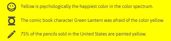
There have been myriad attempts to classify how people react to different individual colors:

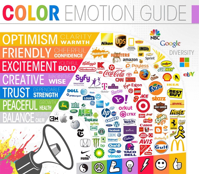
But the truth is that color is too dependent on personal experiences to be universally translated to specific feelings. Research shows that personal preferences, experiences, upbringings, cultural differences, and context muddy the effect that individual colors have on us.
So the idea that colors such as yellow or purple are able to evoke some sort of hyper-specific emotion is about as accurate as your standard palm reading.
Consider the inaccuracy of making broad statements such as “green means calm.” The context is absent: Sometimes green is used to brand environmental issues, like Seventh Generation, but other times it’s meant to brand financial spaces, such as Mint.
And while brown may be useful for a rugged appeal — see how it’s used by Saddleback Leather — when positioned in another context, brown can be used to create a warm, inviting feeling (Thanksgiving) or to stir your appetite (every chocolate commercial you’ve ever seen).
But there’s still plenty to learn and consider if we humbly accept that concrete answers aren't a guarantee. The key is to look for practical ways to make decisions about color.


How to make practical decisions about color in your marketing and branding
The bottom line is that there are no clear-cut guidelines for choosing colors for your brand. While it would be nice to be able to simply look at an infographic and make the right decision, the reality is that the answer to “What colors are right for my brand?” is always “It depends.”
It’s a frustrating answer, but it’s the truth. The context you’re working within is an essential consideration. It’s the feeling, mood, and image that your brand or product creates that matters.
The good news: Research into the psychology of color can help you make the right choice.
The right color is appropriate for your brand
In a 2006 study, researchers found that the relationship between brands and color hinges on the perceived appropriateness of the color being used for the particular brand. In other words: Does the color fit what’s being sold?
When it comes to picking the “right” color, research has found that predicting consumer reaction to color appropriateness is far more important than the individual color itself.
So when considering colors for your marketing and branding, ask yourself (or better yet, collect customer feedback): “Is this color appropriate for what I’m selling?”
The right color shows off your brand’s personality
Purchasing intent is greatly affected by colors due to their effect on how a brand is perceived; colors influence how customers view the “personality” of the brand in question.
And while certain colors do broadly align with specific traits (e.g., brown with ruggedness), nearly every academic study on colors and branding will tell you that it’s far more important for colors to support the personality you want to portray instead of trying to align with stereotypical color associations.
Psychologist and Stanford professor Jennifer Aaker has conducted studies on this very topic, and her paper titled “Dimensions of Brand Personality” points out five core dimensions that play a role in a brand’s personality.

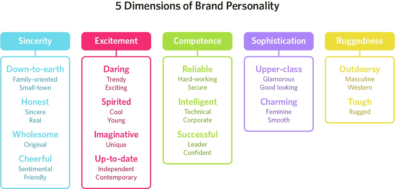
Brands can sometimes cross between two traits, but they are mostly dominated by one.
Ask yourself: what do I want my brand’s personality to be, and how can I use color to convey that personality?
The right color appeals to your audience
One of the more interesting examinations of color psychology in relation to gender is Joe Hallock’s work on “Colour Assignment.”
Hallock’s data showcases some clear preferences in certain colors across gender. It’s important to note, however, that most of his respondents were from Western societies. One’s environment — and especially cultural perception — plays a strong role in dictating color appropriateness for gender, which, in turn, can influence individual color preferences.
Additional research on color perception and color preferences shows that when it comes to shades, tints, and hues, men generally prefer bold colors while women prefer softer colors. Also, men were more likely to select shades of colors as their favorites (colors with black added), whereas women are more receptive to tints of colors (colors with white added).
Although this is a hotly debated issue in color theory, I’ve never understood why. Brands can easily work outside of gender stereotypes. In fact, I’d argue many have been rewarded for doing so because they break expectations.
“Perceived appropriateness” shouldn’t be so rigid as to assume a brand or product can’t succeed because the colors don’t match surveyed tastes, which leads me directly into the next point ...
The right color differentiates your brand
Additional studies have revealed that our brains prefer immediately recognizable brands, which makes color an important element when creating a brand identity. One journal article even suggests it’s important for new brands to pick colors that ensure differentiation from entrenched competitors.
Choosing the right color can help your brand stand out. Consider the psychological principle known as the Isolation Effect: It states that an item that “stands out like a sore thumb” is more likely to be remembered.
Research clearly shows that participants are able to recognize and recall an item far better — be it text or an image — when it blatantly sticks out from its surroundings.
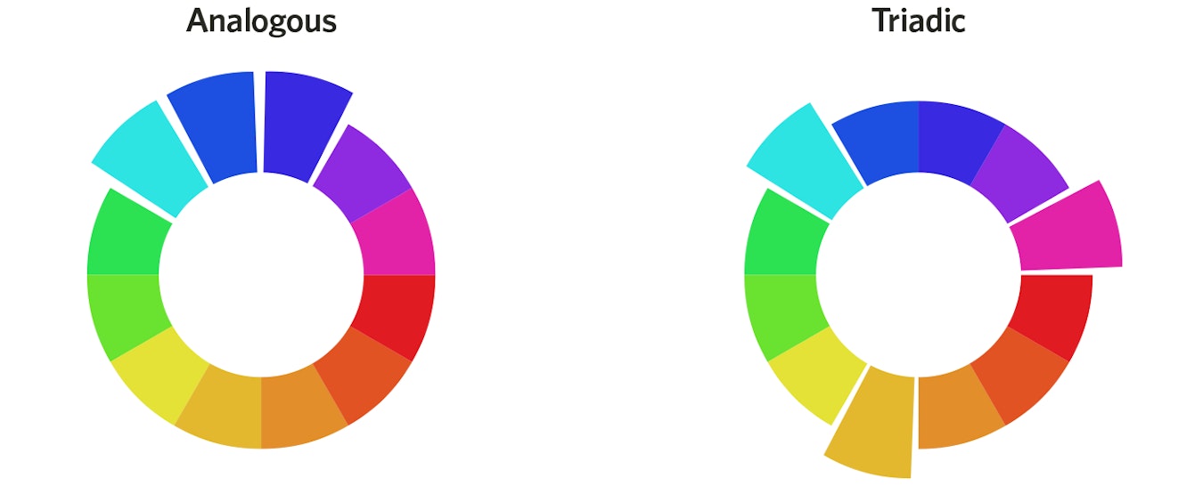
Two studies on color combinations, one measuring aesthetic response and the other looking at consumer preferences, found that while a large majority of consumers prefer color patterns with similar hues, they also favor palettes with a highly contrasting accent color.
In terms of color coordination, this means creating a visual structure consisting of base analogous colors and contrasting them with accent complementary (or tertiary) colors:

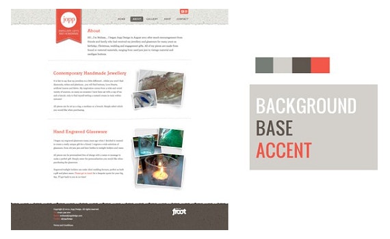
This concept plays a big role in marketing, too. Another way to think of it is to utilize background, base, and accent colors, as designer Josh Byers showcases below, to create a hierarchy on your site that “coaches” customers on which color encourages action.

Why does this matter? Understanding these principles will help keep you from drinking the conversion rate optimization Kool-Aid that misleads so many people.
Consider, for instance, this oft-cited example of a boost in conversions due to a change in button color.


The button change to red boosted conversions by 21 percent. However, we can’t make hasty assumptions about “the power of the color red” in isolation.
It’s obvious that the rest of the page is geared toward a green palette, which means a green call to action simply blends in with the surroundings. Red, meanwhile, provides a stark visual contrast and is a complementary color to green.
A final but critical consideration is how we define “success” for such tests. More sign-ups and more clicks are just single measurements — often misleading ones that marketers try to game simply because they can be so easily measured.
The right color has the right name
Although different colors can be perceived in different ways, the descriptive names of those colors matter as well.
According to a study titled “A rose by any other name ...,” when subjects were asked to evaluate products with different color names — such as makeup — fancy names were preferred far more often. For example, “mocha” was found to be significantly more likable than “brown,” despite the fact that the subjects were shown the same color.
Additional research finds that the same effect applies to a wide variety of products; consumers rated elaborately named paint colors as more pleasing to the eye than their simply named counterparts.
It has also been shown that more unusual and unique color names are preferable for everything from jelly beans to sweatshirts. For instance, crayon colors with names such as “razzmatazz” were more likely to be chosen than names such as “lemon yellow.”
Finding your own palette
We’re at the end of this post and there’s still no cheat sheet for choosing the perfect color or color scheme in sight. In fact, we may have raised more questions than answers. What a ripoff.
The truth is that the kaleidoscopic nature of color theory means we may never have definitive answers.
However, just because a topic is peppered with plenty of “maybes” and “sort ofs” doesn’t mean we should stop thinking critically about it. Use the research available to challenge preconceived notions and to raise better questions; it’s the one consistent way to reach better answers.