Illustrations Are More Than Digital Eye Candy


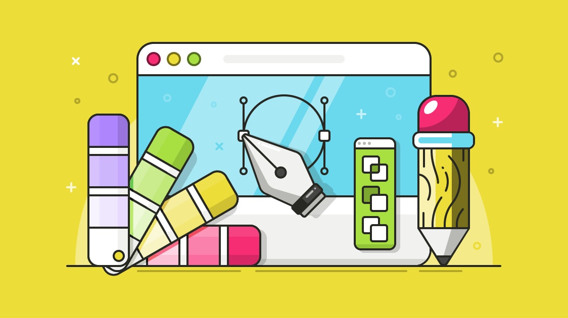
Since the early days at Help Scout, we’ve outfitted all of our blog posts with custom illustrations.
While bright colors and clear theming provide something fun to look at, illustrations are much more than digital decor. Individually, they reinforce and even further develop important points in a piece of writing; collectively, they coalesce to form your brand’s visual fingerprint.


Illustrations give content its identity
If you think about media that you love, you’re likely to recall its “identity” in addition to the content itself. Pink Floyd’s Dark Side of the Moon is inseparable from its iconic album cover, and it’s hard to discuss “Jaws” without picturing the emblematic movie poster (and the chilling theme music). Identity is a collage of many different elements, and they all contribute to a lasting impression. This impression is your brand.
Now consider this in the context of a blog post, and the use of a hastily chosen stock photo doesn't seem like such a good idea anymore. Do you really want to form your content's identity with snapshots from the bargain bin?
It's true that The Old Man and the Sea doesn’t contain any sweet graphics. Good writing stands tall without ornament. At the same time, every piece of a creative canvas should be put to good use. Wasted space is wasted opportunity.
Forming a visual fingerprint with illustrations
The best way to create a consistent visual imprint is to establish (and follow) a set of concrete principles. They become your approach — a way to stay on the right path, a way to make work repeatable but not repetitive. With regard to illustrations, here are a few ways we steer the ship.
Favor connections over decoration
Every visual should augment the content it inhabits. Otherwise, it’s just a cute drawing, and those belong on the fridge. A successful visual interpretation can introduce a new perspective in the prose, so start by understanding what key points the author is making.
I begin by reading the post once to get a summary. Then I read it a second time to scan for copy that I can turn into an illustration. More often than not, there’s mention of a salient person, place, or thing. Sometimes it’s blatant, sitting right there in the title, or it may be hanging out as a metaphor. Other times a little extra creativity is required to draw something tangible out of the abstract. There’s no standard procedure, and occasionally the solution is a visual that, at the bare minimum, doesn’t require guesswork from the reader.
Explore widely, refine deeply
Once I’ve chosen which visual direction to take, I quickly sketch out a few concepts. Here’s where it becomes obvious that drawing isn’t my forte.

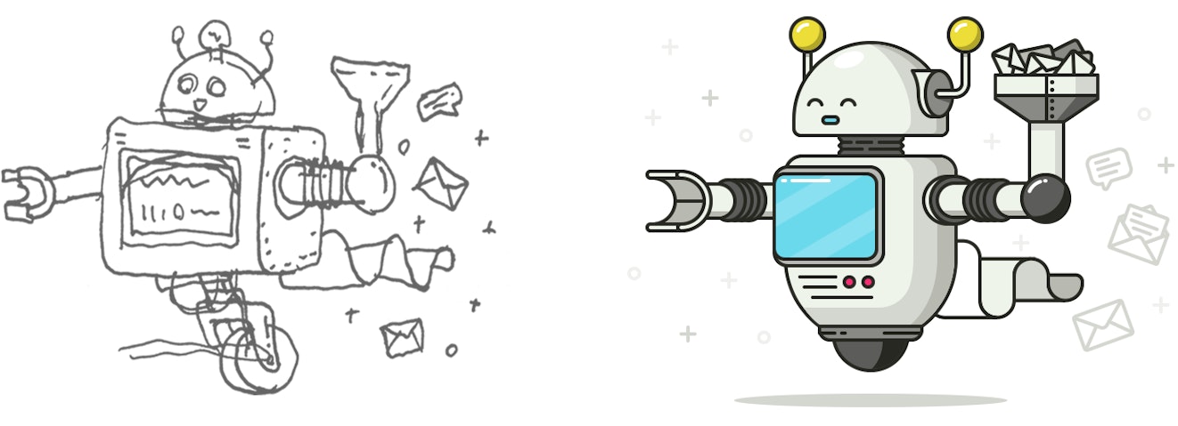
That’s OK. The goal of sketching is to let quantity lead me to quality. Rough mockups help to evaluate composition, color, and how engaging the idea will be before diving in and creating an entire illustration. No need to sweat the details yet — I normally limit myself to five minutes max per concept. If in that time I’m not satisfied with the result, it’s time to explore elsewhere (R.I.P., Unicycling Robot. You will be missed).
Design the frame before the frills
Once I have a basic direction, sketched out or mentally drawn, I build the skeleton with vectors. Vectors are digital point-to-point paths that can be drawn as simple shapes, then manipulated into virtually any form imaginable.

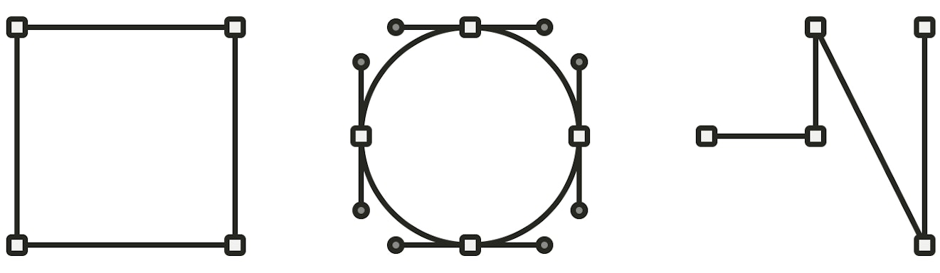
Though some may find it debatable, there isn’t a single object in this cosmic, multifarious universe that can’t originate as either a square or circle. For that reason, I start each illustration with a square (or on rare occasion, a circle), set the color and width of the border, then scale it to about the size I want my first object to be. I continue this process of combining and subtracting shapes until the object has taken form.
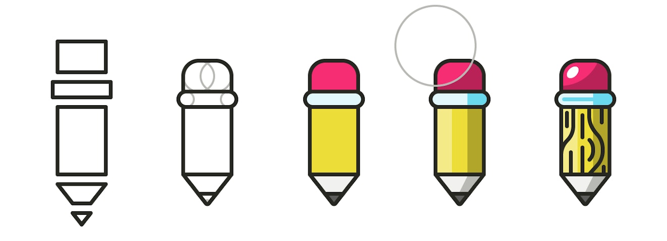
Once the objects are created and make up an aesthetically pleasing composition, I add some flair to make it pop a little more. This final 10% of the design process is the most important; it’s the chance to make something good into something great. This includes nudging shapes, adding depth by creating reflections and shadows, and perhaps scattering some stars across the background. It’s important to find a balance here, because too much glam will eventually become noise. Subtlety is the name of the game, since harsh shadows or two many sparkles will only distract from the story being told.
Be deliberate about color
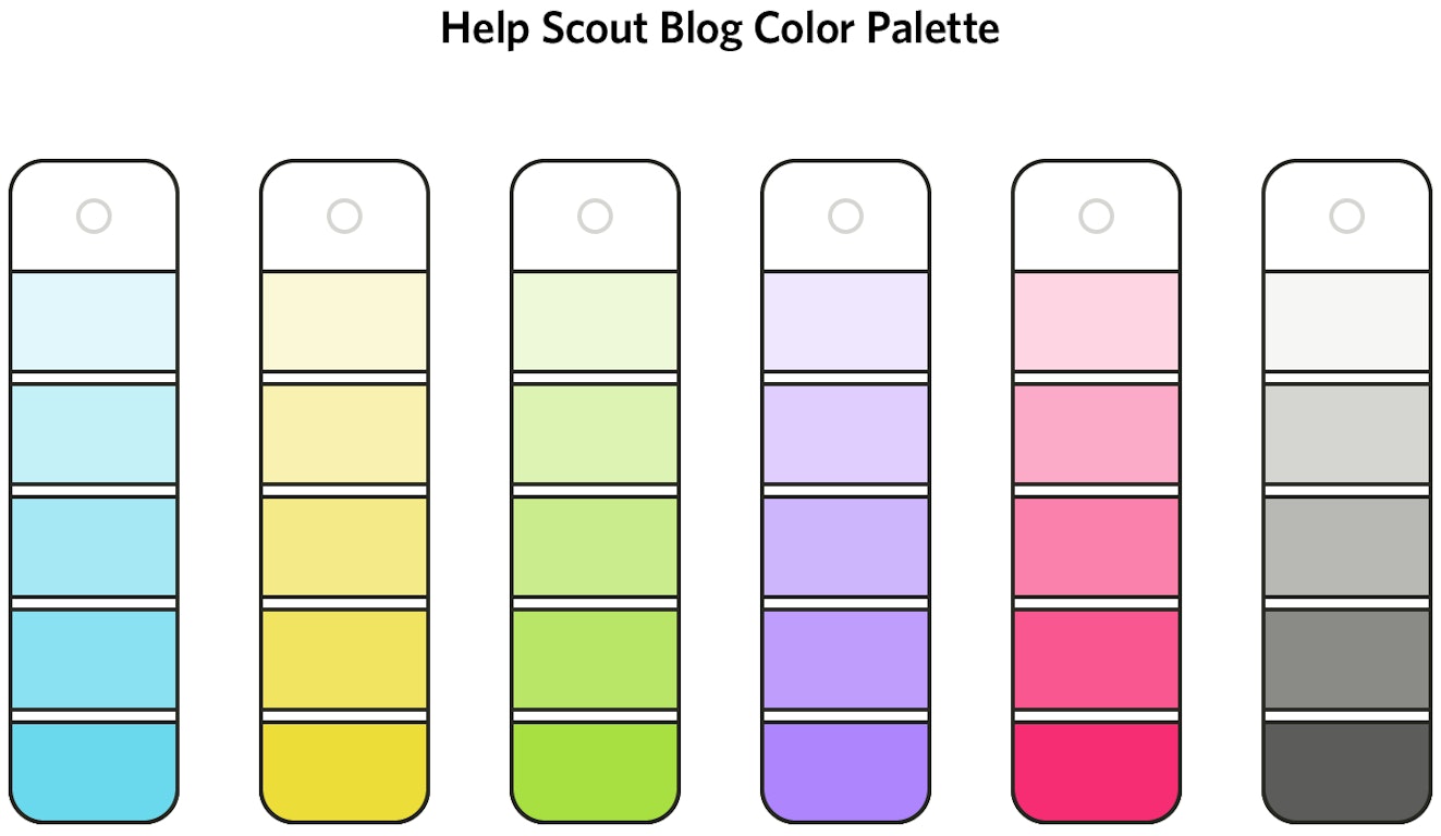
The world of color is complex, and with infinite ways to harmoniously combine tints and shades, it can be extremely daunting. Begin by creating a palette, including colors and shades, and stick with that palette for all your illustrations and publications. When choosing colors for the Help Scout blog, I started with the jobs they were responsible for. First, they should represent our company with a bright, optimistic feel. Second, they needed to grab the reader’s attention and keep a firm grip.
That’s because editorial content doesn’t just live on your site; it’s distributed through other systems. Every piece of the puzzle — headline, copy, and illustration — must compel people to click, while not succumbing to the clickbait arms race. I decided on bold colors that could stand alone or cohesively exist altogether. The palette includes 6 main colors, each with 7 different shades. It also includes a family of black, because just try to take that away from me.

Strong identities don’t happen by accident
Illustrations are a dynamic method of communication that put designer and writer on the same page. You can help tell more vivid stories, and you can connect with readers before they start the first sentence.
While they aren’t required to build a strong visual identity, remember that whatever impression you choose to pursue doesn’t live in isolation: it contends with everything else. If you don’t actively strive to stand out, you’ll be sure to blend in.