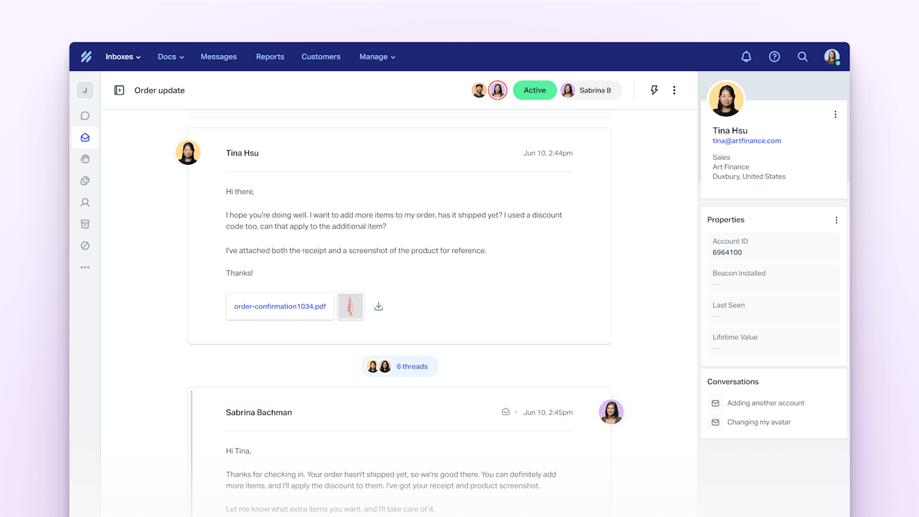
Evolving Brand Design at Help Scout


Rebrands are risky business. Good ones elevate the look and feel of a brand and resonate with power users (Webflow, anyone?). Less than stellar ones feel contrived. Some rebrands are polarizing and cause a ruckus on social, only to be deemed successful when the dust finally settles. Remember when the new Instagram logo dropped?
It’s a narrow target, but there is a sweet spot where rebrands feel “right,” the changes are almost obvious, and the work paves the way for years of growth.
So what separates the good from the bad and the fitting from the forced? In the past year, we evolved the Help Scout brand and learned a lot in the process. While each journey is unique, there are some steps any team can take to make big changes happen, quickly and at scale.
Set a clear vision (and don’t be too precious)
We set out by forming a cross-functional working group that included representatives from the executive, brand, and product design teams. Taking stock of our current brand highlighted bottlenecks and helped identify aspirations.
Our new brand needed to be bold and opinionated, and communicate the craft and power of our product. Teams needed to have the tools and systems to scale this work out, and the brand and product needed to be as connected as ever. Easy, right?

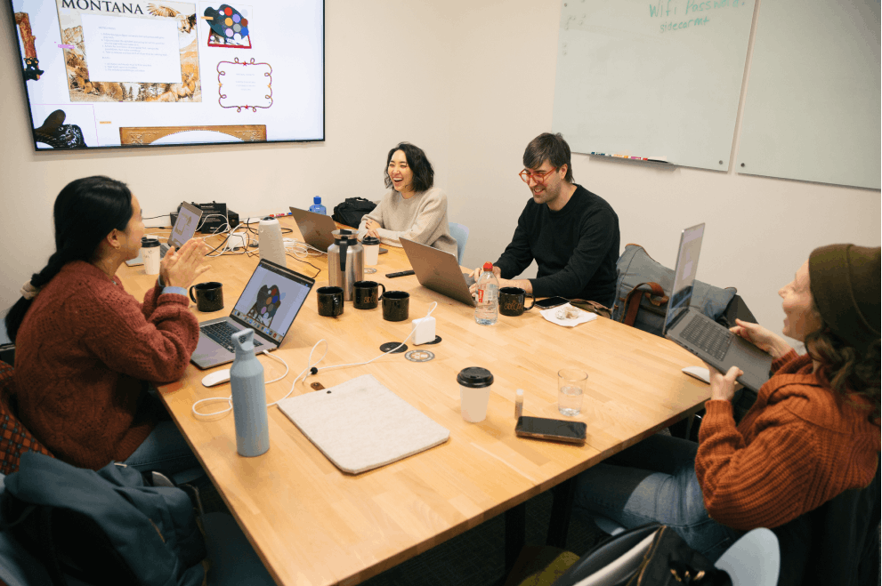
We wanted to work transparently and do the work in-house, so we held monthly syncs and shared frequent updates. This kept feedback loops small and ensured we had buy-in along the way. We structured the workstream to exist in parallel with day-to-day work carried out by the creative team.
We agreed that new ideas that felt strong could find their way into the work we were actively shipping. The brand evolution process trickled out as we were defining it. Our not-too-precious mentality gave us a brilliant opportunity to test reception in the market, loop in more team members, and reduce work on the tail end.

Root changes in values
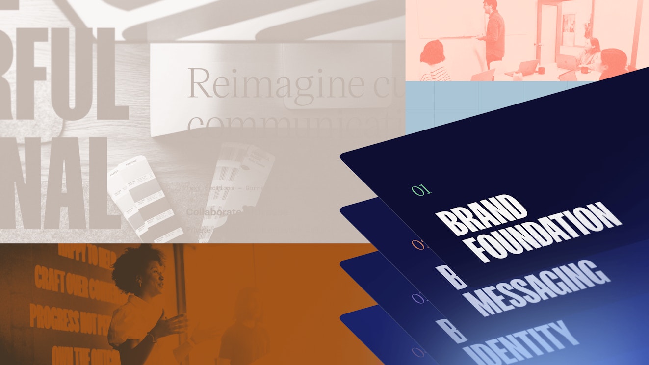
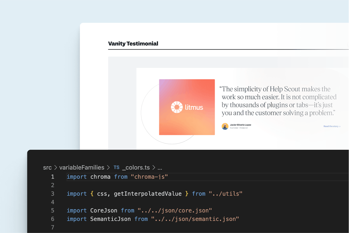
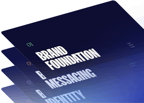
We knew that creating guidelines and systems — all derived from and aligned to our values — would unlock our small but mighty in-house team. What would become an ~80 page document set the foundation for rollout and clarified our visual and verbal systems.
Brand foundation and messaging
Truing up our company vision, mission, and values was a critical step in our process. Solidifying our brand foundation gave us a tonal benchmark for every following decision, from writing copy to choosing typefaces.
With values in tow, we consolidated our brand writing principles and product messaging into one document, further synchronizing our brand. New boilerplate content, value props, and key messaging served as a jump-off point for everything else we’d write.
Brand identity
While bigger changes were on the table, the successful form factor and values-aligned meaning of our current logo guided us to refine rather than overhaul. The mark resembles a subtle, abstract “H,” and our CEO Nick Francis let us know that he thinks of the logo mark as the three fingers of the “scout’s honor” sign. We updated the letterforms to be more modern and legible, adjusted proportions, and introduced our new core brand color, Cobalt. We ended up with a more scalable logo and a timeless wordmark, and we kept all of our hard-earned equity. Win-win-win.

Brand system
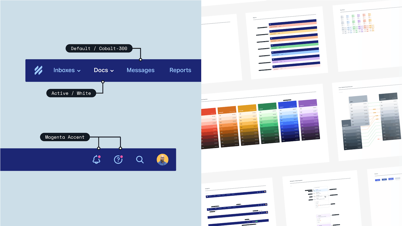
To ensure our team had the tools to create work that delivered on the bold, opinionated aspirations of the brand, we created a new brand tool kit that enabled designers to build at scale. We shored up our overarching visual direction, repositioned the product as our primary storytelling tool, and paired it all with a more expressive typestack.
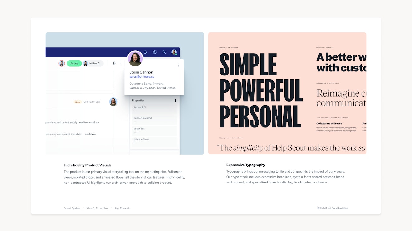
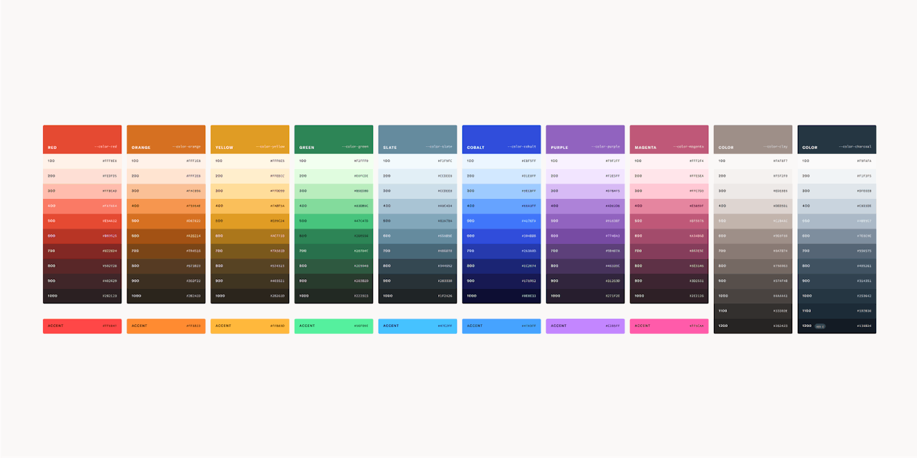
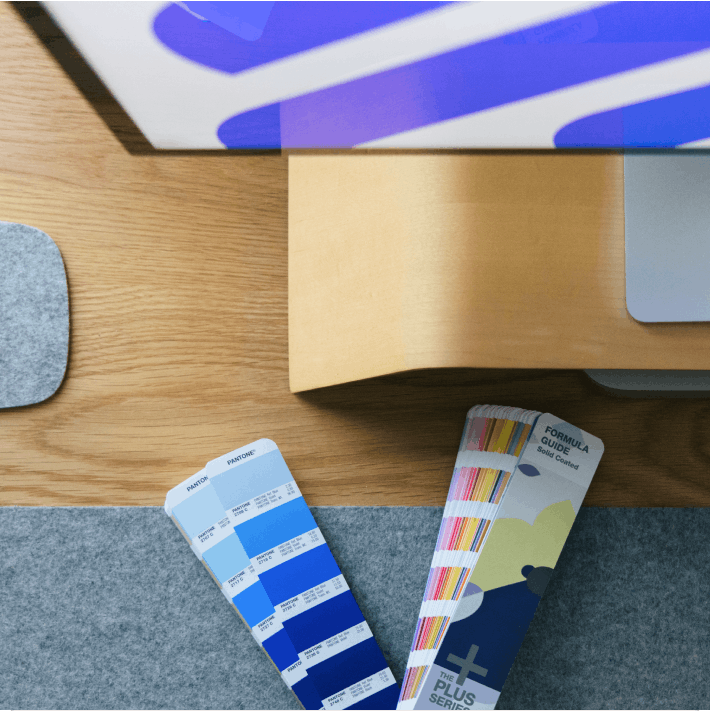
We revisited our palette to offer a fuller set of tints and shades across the color spectrum. This enables us to create accessible UI and site pages as well as vibrant editorial content and visuals.

Build a system (and be willing to break it)
Armed with the road map of brand guidelines, we built systems to keep our teams connected to the same sources and guidelines. Those sources were designed to change and be fluid.
Making big, global changes
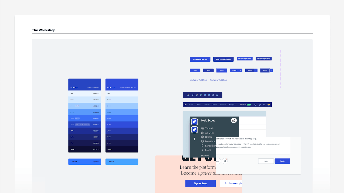
Design systems have a reputation for being rigid. While that might be the case sometimes, systems can also be a means for iteration and global change. Setting up dozens of type styles with font-size and line-height tokens sounds like a lot of work (and it is), but being able to live with those styles (and change them in one fell swoop) is empowering.
At one point in the process, we took a good, hard look at our Cobalt 600 / Action Default color swatch. Was it eye-catching enough? We took a beat, workshopped the color ramp, and, in a few clicks, were able to roll the change out across components, code, logos, and more. The advantage of a system isn’t that it’s fixed and defined. The true power of a system is in its fluidity, where changes are holistic and not one-off.
Refreshing the marketing site
In the Johnny Cash song “One Piece at a Time,” Cash sings from the perspective of an automobile assembly line worker who would steal one part per day, eventually building himself a new car. We built our car (marketing site) the very same way, adding our new design system and brand direction one site component at a time. Now that all the building blocks are new and dialed-in, the whole site feels dialed-in. By focusing on the building blocks, we’ve enabled multiple teams to create more pages without much development and design support.


Deepening our two-way sync between brand and product
We’ve always made a point to work shoulder to shoulder as product and brand design teams. For years we’ve shared design systems, and our work is strongest when all parties are involved. Our new product-focused visual direction relies on that alignment more than ever.
Improvements to our new system deepened that connection by creating more shared elements and tokens. This also means that the product takes center stage on both sides of the login screen, creating a sense of continuity for visitors and customers alike.
We were bullish on staying in lockstep with the product team by syncing up the launch of our new brand with the overhaul of our core product feature, Inbox. Not only have we modernized the inbox experience with a powerful new editor (and much more), but the entire app has been rethemed to match the new brand. You can see more Inbox features across the marketing site by starting a free trial or opting-in as a customer today.
Forecast the future
All told, we completed our brand evolution in just over a year. This extremely lean timeline was made possible by the talent of our in-house team and because our systems were built with change in mind. Our systems and guidelines-driven approach wasn’t about etching decisions in stone. Instead, our approach created an ecosystem that drives cohesion and welcomes iteration on a more global level.
Did all this work hit the rebrand sweet spot? So far we’ve received great feedback, kept our high-performing SEO efforts intact, and even had pages like the AI feature page motivate a higher rate of folks to try the software. One visitor cited, “If the new look feels like it’s always been there, you’ve done it right. And, by golly, this one feels natural.”
While the reception’s been as good as we could hope, our team knows that brand work is never done. I personally subscribe to the Living Brand philosophy, espoused by Michael Jager of Solidarity of Unbridled Labour design studio: “Brands are living things. They grow. Adapt. Evolve. To flourish, they need to be nurtured.”
Our approach leaned heavily on setting a solid foundation. Doing so set us up for the next (and arguably most important) stage — to nurture the brand and continue to evolve. Our teams now have the systems and tools to go deeper and faster at scale, charting a course toward — and enabling — the innovation to come.

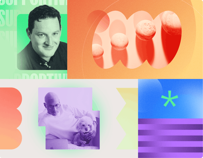
Matt Plays
Matt Plays is the Creative Director at Help Scout. He’s a New England-based designer with a thing for skateboarding, rock climbing, and chicken parm’.