Why a Visual Really is Worth 1,000 Words


Just about everyone has stumbled over a confusing passage in a textbook, only to have clarity restored thanks to “See Fig. A.”
Visuals, graphics, and charts can concentrate and present information in a way that sticks. Skill in visual communication has become nearly as indispensable as clear, compelling writing.
To borrow an example from author Mike Parkinson, the usefulness of text paired with visuals becomes obvious when you try to answer, “What is a circle?”

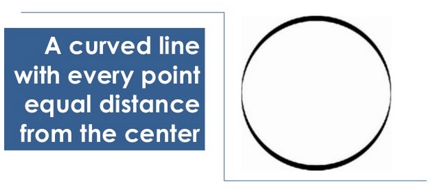
Using just one or the other can create needless confusion and demand more effort from the reader. The sweet spot is in showing and telling. In that spirit, let’s look at a few ways to effectively communicate with visuals.


1. Look for flaws in text-only communication
What’s the most difficult thing to understand when sharing the information through text? This is a useful question to begin with when defining why a visual would help.
Parents familiar with Astro Cat’s Frontiers in Space may recall this example of what the solar system would look like if the Earth were the size of a cherry tomato:

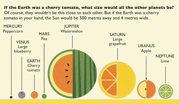
The problem with using just text to describe the size of planets is the poor job it does of illustrating scale—knowing Jupiter’s surface area is 6.1419×10¹⁰ km2 doesn’t mean much, because it’s too large to perceive. With a visual, we gain a concrete sense of how big the Earth is compared to the other planets.
2. A visual is a slide in your “presentation”
Great visual communicators pair their talents with speaking more often than writing. Indeed, when using visuals, it can be helpful to think of the work as a “presentation” instead of an article or essay—doing so will encourage you to follow the lessons learned from veteran presenters.

Above is a slide from YCombinator’s How to Design a Better Pitch Deck. Not surprisingly, the advice carries over nicely to any form of visual communication. You create visuals to condense information and punctuate important points; don’t drown out your own voice by saying too many things at once.
3. Use visuals to highlight contrast

The very nature of visuals encourages “at a glance” learning, making them well suited for showing a clear contrast between two items. A wide range of this vs. that or before-and-after comparisons are up for grabs.
There’s typically a winner you’re looking to highlight, so you’ll want to dust off an oldie and use a tested marketing approach: reinforce that your opinion is the smart one, and make the other guy look silly. No wonder comparative visuals are so commonly used in persuasion.
4. Use visuals to show flow and progression

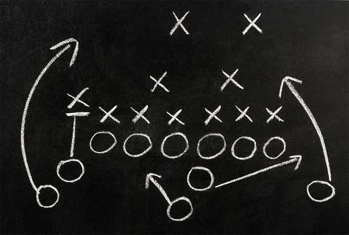
Illustrated football plays make one thing instantly clear: it’s easier to show movement, progression, and “flow” in visual form than text (but please, easy on the flow charts).
The connecting idea is a path. When you have a path to show, opt for a visual—it’s easy to overwhelm an audience with just a few splitting paths: “Well, you can do X, and if that works, you can move on to Z, but if it doesn’t you’ll have to do W, or possibly V…”, and it only goes downhill from there.
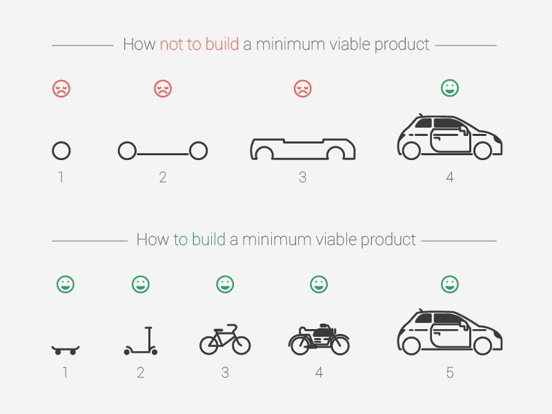
Even when showing linear progression, such as the difference between X --> X2 --> X3 and X --> Y --> Z, visuals can be processed much faster. The now well-known diagram from "How Spotify Builds Products," re-imagined by designer Kirill Shikhanov, demonstrates the point:

5. Connect to existing ideas
Creativity is about connecting ideas. There is bound to be an existing portrayal of the point you’re making—all you need to do is find the connection. Abstract what you’re saying to a core idea; once there, it’s easier to latch on to real-world examples.

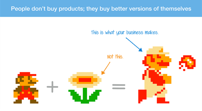
Samuel Hulick proposed that benefits come down to selling customers a “better version of themselves.” He made the connection to Mario and the fire flower power-up—a classic instance where the resulting product was better than the sum of its parts.
6. Don’t be afraid to get obvious

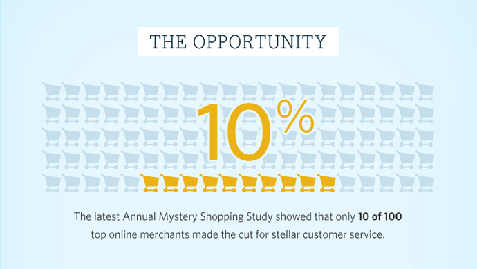
Visuals can complement text and data without a lot of pomp and fluff. Above is an example from research we found on the effects of bad customer service.
It’s a fact easily shared through text, but we thought the information was meaningful and, frankly, kind of shocking—the role of the visual was to act as a highlighter. Making information stand out is a pretty important job when you consider how prone we all are to scanning.
Did you take a second to look at the graphic before reading this section? Mission accomplished.
7. A simple reminder for visualizing data
I’ll spare us both a lengthy “post within a post” and instead recommend you read The WSJ Guide to Information Graphics.
The job of charts and graphs is to clearly (and responsibly) show changes and trends in data, usually over time. The data either does or doesn’t have something to say; first you need to get the right message, then you need to get the message right.
There’s opportunity to say something revealing, insightful, or just plain clever without the need to compete with The New York Times in regard to quality of execution:
</p>— Matthew Hankins (@mc_hankins) <a href="https://twitter.com/mc_hankins/status/653621441053753344">October 12, 2015</a>,— Matthew Hankins (@mc_hankins) <a href="https://twitter.com/mc_hankins/status/653621441053753344">October 12, 2015
There’s also a certain genius in leaving well enough alone; charts don’t need to be extravagant to do the job. The famed “world’s worst pie chart” will now make its closing statements:

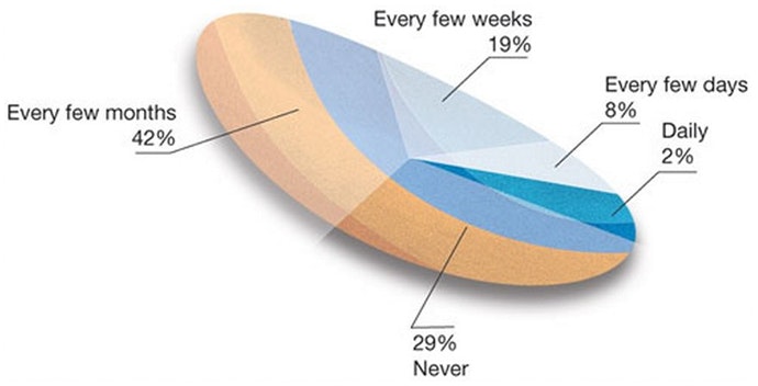
The moment you find yourself adding 3D elements, excessive coloring, or “pizzazz,” something’s gone terribly wrong.
Showing and Telling
Strong writers too often find themselves working hard instead of smart as they fight an uphill battle with prose alone. It’s an understandable mistake; when you’re wielding a sturdy hammer, everything starts to look like a nail.
We all need to be reminded that the message is the only thing that counts, and writing is but one medium available.
The next time you find yourself telling someone, “Well, it looks like this,” consider spending the extra effort to show them instead.